


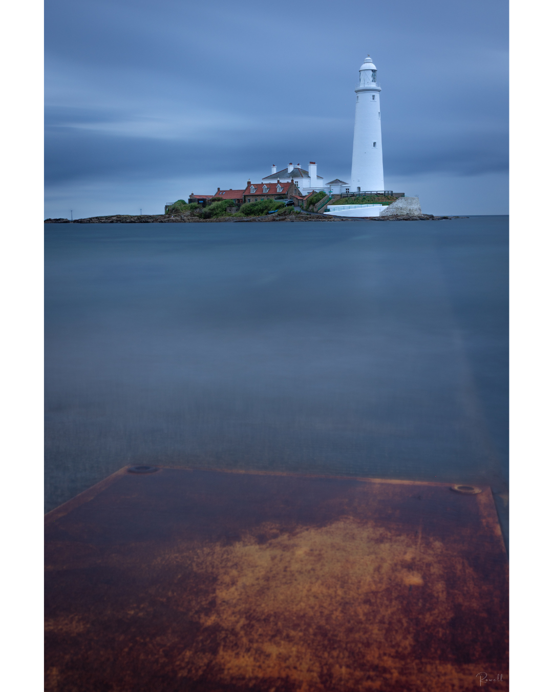

You have to use what you have in front of you, even when that means it is not the perfect light. As photographers, if we waited for the perfect conditions, we would hardly ever venture out of the house at all. Therefore, when it comes to landscape and coastal photography, you need to be adaptable and learn to deal with whatever lies in front of you, embracing the unique opportunities presented by the moment.
My approach to this image represents a slightly different interpretation of the usual photography rules, particularly since I have two predominant subjects in this composition. First, there is the rusty orange metal plate that I strategically used to lead the eye into the shot in a dynamic manner. Second, the lighthouse stands tall as an anchor for the image at the top, providing stability, context and more importantly balance.
The main reason I decided upon this particular composition was not just the elements involved, but also due to the striking colours. Orange and blue are situated opposite each other on the colour wheel, and this contrasting relationship means we, as humans, find them to be a more visually appealing colour combination compared to those colours that are placed right next to one another.


